September 22, 2026
Convert More Spanish Visitors with 2

The best Spanish call to action matches its grammar to the reader’s stage: use the infinitive (“Descubrir,” “Ver”) for browsers who aren’t ready to commit, switch to the imperative (“Compra,” “Reserva ahora”) once someone is deciding, and reach for first-person phrasing (“Quiero mi cotización”) when you need them to feel ownership. Keep every CTA to 2–6 words, then let a short line of microcopy underneath do the work of easing doubts about time, cost, or privacy.
TL;DR:
- Using the infinitive form in Spanish CTAs creates a low-pressure tone suitable for exploration and awareness stages, with microcopy like “No obligation” easing hesitation.
- Imperative commands are more effective in decision-making phases when urgency is appropriate, with example phrases such as “Book your appointment” or “Buy now” to drive conversions.
- First-person phrasing increases psychological ownership and works best at high-intent moments, exemplified by “I want my free guide” or “I’m reserving my spot.”
- Microcopy that addresses time, privacy, or next steps inside the visual field enhances CTA effectiveness more than footer disclaimers, especially when placed close to the button.
- Testing should focus on one variable at a time, such as verb form or microcopy, with click-through rate and downstream conversions measuring success before consistent deployment across channels.
Table of Contents
- Spanish Call to Action Examples for Every Stage of the Funnel
- Templates and Microcopy That Remove Friction
- How Spanish CTAs Change Across Buttons, Email, Video, and Social
- Getting the Tone Right: Tú, Usted, and Regional Word Choice
- Testing Your Spanish CTAs: What to Measure and When
- How Diazluna Applies These Rules Across Real Bilingual Deployments
- Cultural Triggers That Make Spanish CTAs Land Differently
- CTA Verbs and Phrases by Industry
- What Compliance Rules Apply to Spanish-Language CTAs
- When to Slow Down for Linguistic QA vs. When to Just Test It
- Diazluna: Keeping Your Spanish CTAs Consistent From Click to Conversation
- Sources
- FAQ
Spanish Call to Action Examples for Every Stage of the Funnel
Grammar does more work in Spanish CTAs than most marketers realize. A CTA that sounds neutral in English can sound bossy or oddly formal in Spanish, depending on the verb form you pick. UX writing research on Spanish interfaces shows the infinitive often reads as a calm, low-pressure label rather than a command, which makes it the safer default for anyone still exploring.
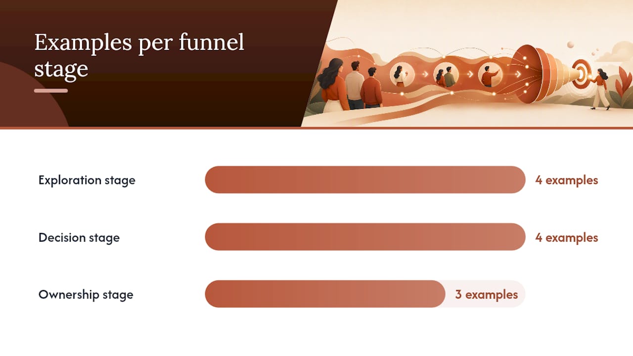
Exploration stage (infinitive, low pressure):
- “Ver precios” (See pricing) — pair with microcopy like “Sin compromiso” (No obligation).
- “Descubrir más” (Discover more) — works well on blog CTAs or “learn more” buttons.
- “Explorar servicios” (Explore services) — neutral enough for a homepage hero.
- “Conocer el proceso” (Learn the process) — good for service pages where trust needs building first.
Decision stage (imperative, direct):
- “Reserva tu cita” (Book your appointment) — strong for clinics and law firms with calendars to fill.
- “Compra ahora” (Buy now) — best when urgency or a limited offer is real, not manufactured.
- “Agenda tu consulta” (Schedule your consultation) — a step softer than “compra,” useful for professional services.
- “Empieza gratis” (Start free) — pairs urgency with zero risk, which Mailchimp’s Spanish CTA guidance flags as one of the stronger combinations for trial signups.
Ownership stage (first-person, personal):
- “Quiero mi presupuesto” (I want my quote) — turns a form submission into a personal decision.
- “Quiero mi guía gratis” (I want my free guide) — a lead-magnet staple.
- “Reservo mi lugar” (I’m reserving my spot) — creates urgency without sounding pushy.
Practitioner testing on first-person phrasing consistently shows a lift over standard imperatives, because the reader is effectively completing the sentence in their own voice rather than being told what to do, according to analysis from Polaris Nexus on culturally specific CTAs.
Stat to remember: Crazy Egg’s research on CTA buttons found that effective CTAs run 2 to 6 words and perform better when a specific benefit sits right in the verb phrase, not buried in a paragraph below. A line like “Sin compromiso” under the button usually helps reduce hesitation more effectively than lengthening the button text, as recommended in this guide on CTA importance.
Templates and Microcopy That Remove Friction
Most Spanish CTAs collapse into three reusable shapes. Once you know them, you can adapt any offer in under a minute.
- Verb + result. “Descarga tu guía” (Download your guide), “Consigue tu descuento” (Get your discount). The verb does the action, the result does the selling.
- Verb + benefit + condition. “Empieza gratis, sin tarjeta” (Start free, no card required). This format front-loads the offer and closes the objection in the same breath.
- First-person ownership. “Quiero mi diagnóstico gratuito” (I want my free assessment). Best reserved for higher-intent moments like lead magnets or trial starts, where research on first-person phrasing shows it increases psychological ownership.
Microcopy is what turns a decent CTA into a converting one. A few patterns worth stealing directly:
- Time: “Solo 2 minutos” (Only 2 minutes) — sets expectations before the click.
- Commitment: “Sin compromiso” (No obligation) or “Cancela cuando quieras” (Cancel anytime).
- Privacy: “No compartimos tus datos” (We don’t share your data) — critical near any form asking for a phone number or email.
- Next step: “Te contactamos en 24 horas” (We’ll contact you within 24 hours) — removes the “what happens now” anxiety that kills form completions.
Pro Tip: Place microcopy directly under the button or beside the form field it’s resolving, not in a footer disclaimer. Crazy Egg’s CTA research notes that friction-reducing text works best when it sits inside the visual field the reader’s eye is already scanning. A privacy line buried in small print at the bottom of the page does almost nothing for the person hesitating over a form five inches above it.
How Spanish CTAs Change Across Buttons, Email, Video, and Social
The same offer needs different phrasing depending on where it lives. A button on a homepage hero has one job: get a click with minimal information. In-form CTAs, by contrast, need to confirm the action the reader is about to complete, since hesitation spikes right before submission.
- Hero/button CTAs: short and benefit-forward, like “Ver disponibilidad” (Check availability). In-form CTAs should echo the specific action: “Enviar mi solicitud” (Submit my request) reduces last-second doubt better than a generic “Enviar.”
- Email CTAs: the subject line sets up the ask, and the button confirms it. A subject like “Tu descuento termina hoy” (Your discount ends today) paired with a button reading “Reclamar descuento” (Claim discount) creates continuity the reader can follow at a glance. Preheaders should reinforce urgency or benefit, never repeat the subject verbatim.
- Video CTAs: on-screen text needs to be even shorter than a button, often just “Suscríbete” (Subscribe) or “Más info abajo” (More info below), since viewers are watching, not reading. The real conversion work happens in the description or the link beneath the video, where you can use a fuller CTA like “Descarga la guía completa aquí” (Download the full guide here).
- Social CTAs: these split into two jobs. Interaction-focused posts use softer language like “Cuéntanos tu experiencia” (Tell us your experience), while conversion-focused posts need direct phrasing like “Agenda tu cita” (Book your appointment) with a link in bio or comment. ActiveCampaign’s collection of Spanish CTA examples shows this split clearly across dozens of real campaigns, with interaction posts consistently softer than direct-response ones.
Getting the Tone Right: Tú, Usted, and Regional Word Choice
Formality is the first fork in the road, and it’s easy to get wrong. Healthcare and legal services often default to “usted” out of respect for the relationship, while consumer brands, fitness apps, and younger audiences lean toward “tú” because it reads as approachable rather than distant.
A few rules of thumb make the decision faster:
- If the reader is trusting you with health, money, or legal matters, “usted” is the safer opening move, especially in first contact.
- If your brand voice is casual, or you’re targeting a younger demographic, “tú” builds rapport faster and rarely feels disrespectful.
- Once you’ve established the relationship (a returning client, an email nurture sequence), you can often shift to “tú” even in professional-service contexts.
- Avoid regional slang or verbs that only make sense in one country. “Chévere” lands well in parts of Latin America and confuses readers in Spain. Neutral verbs like “obtener,” “conseguir,” and “reservar” travel well across regions.
Grammatical mood tracks formality too. Infinitives feel neutral and work in both “tú” and “usted” contexts, which is why they’re such a safe default for top-of-funnel content. Imperatives carry more weight in “tú” form (“compra,” “reserva”) than in “usted” form (“compre,” “reserve”), so match the mood to the pronoun you’ve already chosen, not the other way around. Localization guidance on regional CTA testing recommends testing Spain and Latin America variants separately whenever budget allows, since formality preferences and even preferred verbs shift by region.
Pro Tip: Never assume a direct translation from English carries the same tone in Spanish. “Click here” translates literally to “Haz clic aquí,” but a native speaker is far more likely to write “Ver más” or “Continuar.” Validate every CTA with a native speaker from your actual target region before it goes live, a step linguistic validation research treats as non-negotiable for anything beyond a quick internal test.
Testing Your Spanish CTAs: What to Measure and When
Run one variable at a time, or you won’t know what actually moved the needle. Three tests consistently produce useful data:
- Verb form swap. Test an infinitive CTA against an imperative version of the same offer on the same page, holding everything else constant.
- First-person vs. imperative. Test “Quiero mi guía” against “Descarga tu guía” on a lead-magnet form to see which drives more completions.
- Microcopy vs. no microcopy. Add a single line like “Sin compromiso” under an existing CTA and measure the lift against the control.
Track click-through rate as your primary signal, but don’t stop there. CRO guidance from Crazy Egg recommends watching the metric that actually matters downstream, like appointment bookings or completed purchases, since a CTA that wins on clicks but loses on completions isn’t actually winning. On low-traffic pages, give a test time to gather enough conversions before calling a winner. A handful of clicks in either direction on a page that sees ten visitors a day tells you almost nothing.
Once you have a winner, roll it out across every channel using that phrasing, then re-run a quick native-speaker check before it goes live in email, social, and your website simultaneously.
How Diazluna Applies These Rules Across Real Bilingual Deployments
Building CTAs that work in Spanish is one part copywriting and one part infrastructure. A perfectly worded “Reserva tu cita” means little if the WhatsApp message that follows reverts to stiff, machine-translated Spanish, or if the AI receptionist answering the resulting call speaks English by default. Diazluna’s own deployments for dental, legal, and healthcare practices treat the CTA as the start of a conversation that has to stay consistent across the website, the 24/7 AI receptionist, and WhatsApp.
For deeper context on why this consistency matters, see the related coverage on Spanish dental SEO, bilingual law firm websites, and why Spanish tone matters for client retention.
Cultural Triggers That Make Spanish CTAs Land Differently
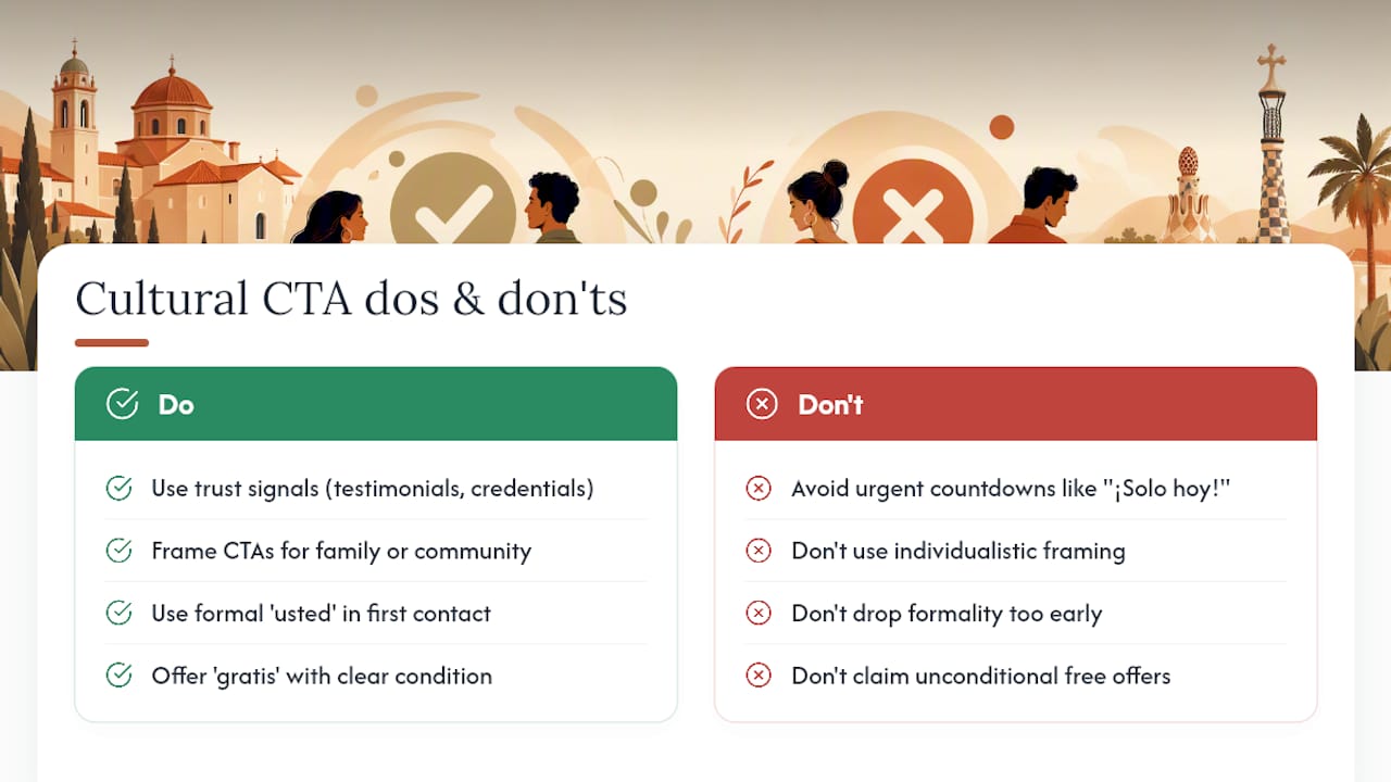
Trust signals carry more weight in Spanish-speaking markets than urgency tactics borrowed from English-language playbooks. A countdown timer screaming “¡Solo hoy!” (Only today!) can read as aggressive or even suspicious to a reader who’s used to more relationship-driven sales language, particularly in healthcare and legal contexts where trust has to be earned before a click.
Family and community framing tends to outperform individualistic framing. A CTA like “Cuida a tu familia hoy” (Take care of your family today) often resonates more in a healthcare context than “Cuídate a ti mismo” (Take care of yourself), because collective wellbeing is a stronger cultural motivator across most Spanish-speaking audiences than individual benefit alone.
Formality signals respect, and respect signals trustworthiness. That’s part of why “usted” still dominates first-contact CTAs in legal and medical services, even among younger audiences who might prefer “tú” in casual contexts. Skipping that formality too early can read as presumptuous rather than friendly.
Word choice around cost also needs care. “Gratis” (free) is a strong trigger, but pairing it with a clear condition, like “Consulta gratis, sin compromiso,” prevents the offer from sounding too good to be true, which is a common hesitation point in markets where aggressive sales tactics have created some skepticism toward unconditional-sounding offers.
CTA Verbs and Phrases by Industry
Different industries call for different verbs, and swapping them in wholesale from one sector to another almost always reads as off.
Dental and healthcare: “Agenda tu cita” (Schedule your appointment), “Consulta gratis” (Free consultation), “Habla con un especialista” (Talk to a specialist). These favor “usted” and calmer verbs, since patients are making decisions about their health, not impulse purchases.
Legal services: “Solicita tu consulta” (Request your consultation), “Habla con un abogado” (Speak with a lawyer), “Conoce tus derechos” (Know your rights). Legal CTAs benefit from language that signals expertise and confidentiality rather than speed.
E-commerce: “Compra ahora” (Buy now), “Añade al carrito” (Add to cart), “Aprovecha la oferta” (Take advantage of the offer). Shorter, punchier verbs work because the buying decision is lower stakes than legal or medical services.
SaaS and trials: “Empieza gratis” (Start free), “Prueba sin riesgo” (Try risk free), “Quiero mi cuenta” (I want my account). First-person phrasing performs especially well here because signup is a personal commitment moment.
Local services (salons, contractors, repair): “Reserva tu turno” (Book your slot), “Pide tu presupuesto” (Request your quote). Direct and practical, since these buyers usually already know what they need.
What Compliance Rules Apply to Spanish-Language CTAs
CTAs aimed at Spanish-speaking markets carry the same legal exposure as any other marketing copy, and sometimes more, since regulators pay close attention to healthcare and financial claims made to Hispanic audiences specifically.
Disclaimers tied to health claims, financial offers, or legal services need to appear in the same language as the CTA itself, not just in a separate English terms page. A Spanish-language CTA promising “Resultados garantizados” (Guaranteed results) next to an English-only disclaimer creates a compliance gap that regulators and plaintiffs’ attorneys both know how to spot.
Data privacy language matters just as much. If a CTA collects personal information, phone numbers especially, the microcopy explaining how that data will be used needs to be accurate and visible before submission, not buried in a linked privacy policy nobody clicks. For healthcare practices, this overlaps with broader confidentiality obligations that extend into how appointment requests and intake forms are worded, not just how they’re stored.
When to Slow Down for Linguistic QA vs. When to Just Test It
High-trust flows, medical intake, legal consultations, anything tied to a compliance claim, deserve native-linguist review before launch. The risk of getting tone wrong outweighs the speed you’d gain from skipping it.
Lead magnets, blog CTAs, and low-stakes offers are different. Ship a reasonable version, run the A/B test outlined above, and let real traffic tell you what works faster than a review cycle ever could.
— Francisco
Diazluna: Keeping Your Spanish CTAs Consistent From Click to Conversation
A well-written CTA is only the opening line. What happens after someone clicks “Agenda tu cita” determines whether that click turns into a client, and that’s where most practices lose Hispanic leads: not on the button, but in the mismatched, half-translated experience that follows it. Some solutions close that gap with a bilingual website, a 24/7 AI receptionist fluent in Spanish and English, and WhatsApp integration that keeps the conversation in the same voice the CTA started in.
That means the same tone you tested on your homepage button carries through to the message a lead gets on WhatsApp, and into the call your AI receptionist handles at 9 p.m. on a Saturday. Instead of paying separately for translation, a call center, and a messaging tool, practices get all three in one subscription: Solo Sitio starts the bilingual website, and Sitio + María adds the 24/7 Spanish-fluent receptionist and WhatsApp flows on top of it. Visit Diazluna to see the plans and request a demo of how a consistent Spanish CTA experience looks from click to appointment.
FAQ
What are some examples of an effective Spanish call to action?
Strong examples include “Reserva tu cita” (Book your appointment), “Quiero mi guía gratis” (I want my free guide), and “Ver precios” (See pricing). Each works because it pairs a short verb phrase with a specific, visible benefit, a pattern Crazy Egg’s CTA research ties directly to higher click-through rates.
What are some creative Spanish CTA examples?
Creative options lean on first-person ownership, like “Quiero mi diagnóstico” (I want my assessment) or “Reservo mi lugar” (I’m reserving my spot), which read more personal than a standard command. Pairing these with microcopy like “Sin compromiso” adds a layer of reassurance without lengthening the button itself.
Can you give examples of effective Spanish video CTAs?
On-screen video CTAs work best short, like “Suscríbete” (Subscribe) or “Más info abajo” (More info below), since viewers are watching rather than reading. The heavier lifting happens in the description or comment link, where a fuller phrase like “Descarga la guía completa aquí” can do the actual converting.
What does a Spanish CTA button need to include?
A Spanish CTA button needs a short action verb, ideally 2 to 6 words, tied to a specific result, plus supporting microcopy nearby that resolves a common objection like time, cost, or privacy. Diazluna applies this same structure across bilingual websites, AI receptionist scripts, and WhatsApp flows so the phrasing stays consistent from the first click through the final booking.