October 9, 2026
Copy Ready Bilingual Contact Forms for Clinics with WCAG

The fastest way to build a reliable bilingual contact form is to start from a copy-ready English-Spanish template with visible, permanent labels on every field, then add a top-right “English / Español” selector and check the whole thing against WCAG labeling rules before it goes live. Clear consent language in both languages matters just as much as translation quality. Some services build this directly into a bilingual front desk for practices that need it done for them.
TL;DR:
- Pair every input with a visible label using matching for and id attributes; grouped fields also need a fieldset, legend, and individually labeled subfields.
- Place the language selector near the top, save the visitor’s choice, and store that language separately so confirmations and staff routing match.
- Keep consent brief and visible in both languages beside submission, require an affirmative choice, and use native review for medical or legal wording.
- Before launch, test every validation rule in both languages, check the form on a phone, and confirm submissions retain the language tag in your CRM.
- Show validation errors in the visitor’s selected language, describe the specific fix, and connect each message to its field with aria-describedby.
Table of Contents
- Copy-ready English-Spanish contact form templates
- WCAG rules that make bilingual forms usable
- Where to put the language switch and why human review matters
- Writing bilingual privacy and consent language
- Deploying the form: three practical paths
- Why bilingual forms need professional-grade execution
- Handling form validation and error messages in both languages
- Managing submissions and notifications across languages
- Localization goes beyond swapping words
- Publisher notes on this guide
- A priority order worth following
- How Diazluna can help you get this right
- FAQ
- Sources
Copy-ready English-Spanish contact form templates
A short, well-labeled form converts better than a long one, and that holds true in both languages. Start with the simplest version your use case allows, then expand only if you genuinely need more fields.
Basic contact form (minimal fields):
- Name / Nombre
- Preferred language / Idioma preferido (dropdown: English / Español)
- Phone / Teléfono
- Email / Correo electrónico
- Message / Mensaje
Appointment intake template for practices:
- Full name / Nombre completo
- Preferred date and time / Fecha y hora preferida
- Service requested / Servicio solicitado
- Insurance provider / Compañía de seguro
- Preferred contact method / Método de contacto preferido (phone, email, or WhatsApp / teléfono, correo o WhatsApp)
Lead capture template with opt-in language:
- Name / Nombre
- Email / Correo electrónico
- “I agree to receive updates about services and promotions.” / “Acepto recibir actualizaciones sobre servicios y promociones.”
Place the language preference field near the top of the form, right after name, so downstream routing (to a bilingual staff member or an interpretation workflow) happens automatically rather than after the fact. For practices juggling ongoing communication after the first contact, a bilingual client follow-up sequence keeps the same language consistent from form submission through appointment reminders.
WCAG rules that make bilingual forms usable
Every field needs a real <label> element tied to its input with matching for and id attributes. Placeholder text disappears the moment someone starts typing, and screen readers do not treat it as a persistent label, so it cannot replace a visible label.
For grouped fields, like a phone number split into area code and number, or a date broken into month, day, and year, wrap them in a fieldset with a legend, and give each subfield its own label so the group is not announced as one ambiguous block. Use aria-describedby to attach longer instructions or format hints (like “MM/DD/YYYY”) to a field without cluttering the visible label, and place your overall form instructions before the opening <form> tag so assistive technology announces them first.
Quick accessibility checklist:
- Every input has a visible, paired label, not just a placeholder.
- Grouped fields use fieldset and legend.
- Required-field indicators are announced, not just shown in color.
- Instructions sit before the form, not scattered mid-page.
The W3C’s Web Accessibility Initiative maintains the specific technique for label association used across most government and enterprise form audits. Testing with a free screen reader like NVDA or VoiceOver before launch catches most of these failures in minutes.
Where to put the language switch and why human review matters
Put the language selector top-right, labeled “English / Español” with both language names spelled as native speakers write them, never “Spanish” on one side and “English” on the other. That small asymmetry reads as an afterthought to bilingual visitors.
- Save the visitor’s choice in a cookie or localStorage so it persists across pages.
- Show the current language clearly, not just in the toggle itself.
- If a Spanish-language page links out to English-only content, say so before the click.
- Favor human-reviewed Spanish over machine-only translation for anything involving consent, legal terms, or medical intake, where nuance changes meaning.
Raw machine translation tends to flatten tone and occasionally gets legal phrasing wrong in ways a native reviewer catches immediately. For forms touching medical or legal fields specifically, a hybrid human-plus-AI review process, like the one outlined in AD VERBUM’s Spanish medical translation checklist, is worth the extra step.
Pro Tip: List “Español” first in the selector if most of your traffic arrives from Spanish-language search queries. Order signals priority.
Writing bilingual privacy and consent language
Keep consent text short, visible near the submit button, and available in both languages at the same time, not behind a toggle.
- English: “By submitting this form, you agree to our Privacy Policy and consent to be contacted.”
- Spanish: “Al enviar este formulario, usted acepta nuestra Política de Privacidad y da su consentimiento para ser contactado.”
- Never use a pre-checked consent box. Require an active click.
- Link the short line to a full bilingual privacy policy rather than cramming every detail into the form itself.
- State clearly, in both languages, how someone withdraws consent later (an email address or unsubscribe link works).
Deploying the form: three practical paths
Pick based on how much control you need versus how fast you need to launch.
- Embedded HTML: full control over labels, ARIA attributes, and styling, but requires someone comfortable editing markup directly.
- Form builders: fastest to launch, though most require manual review afterward to fix missing labels or mistranslated field names.
- CMS plugins: easiest to maintain long-term alongside the rest of your site, with moderate setup time upfront.
Whichever path you choose, run this checklist before publishing: toggle the language switch and confirm every field relabels correctly, run a screen reader pass in both languages, check the form on an actual phone rather than just a resized browser window, and confirm submissions route correctly into your CRM or WhatsApp inbox. If you serve clinics or legal practices, the patient communication tools you already use are worth checking for native form routing before building a separate integration.
Pro Tip: Submit a test entry in Spanish and verify the language tag travels with it into your CRM, not just the raw text. Routing breaks more often on the language flag than on translation.
Why bilingual forms need professional-grade execution
Getting label markup, consent wording, and language persistence right across two languages is not a one-afternoon project, and small mistakes (a missing for attribute, a pre-checked box, an untranslated error message) undercut trust with exactly the clients a bilingual form is meant to reach. Professionals serving Hispanic clients get this right most reliably by relying on a bilingual service that treats both languages as fully native from the start, not as a translation layer bolted onto an English template. The difference between translated and authentically bilingual communication shows up in bilingual customer service outcomes far more than most practices expect.
Handling form validation and error messages in both languages
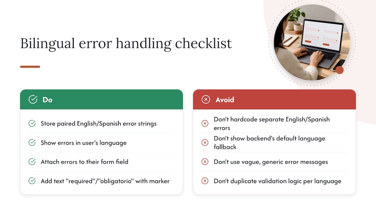
Error messages fail bilingual forms more often than missing translations do, mainly because validation logic gets built once in English and then only partially localized. The fix is to treat every error string as a field in its own right, with an English and Spanish version stored together, not hardcoded separately in two places that drift apart over time.
Show the error in the language the visitor is currently viewing, never in whichever language the backend defaults to. A Spanish-language visitor who submits an invalid email should see “Por favor ingresa un correo electrónico válido,” not a stray English fallback string. Attach the error to its field with aria-describedby so assistive technology announces it immediately after the label, not as a disconnected message elsewhere on the page.
Keep error wording specific rather than generic. “Por favor completa este campo” (please complete this field) helps more than a blanket “Error en el formulario” that gives no indication of what to fix. For required-field indicators, use text (“required” / “obligatorio”) alongside any visual marker like an asterisk, since color or symbol alone does not get announced by screen readers.
Test every validation rule in both languages before launch, not just once in English with a mental note to translate later. A field that silently fails validation in one language but not the other usually means the logic was duplicated instead of shared, which is the most common root cause of bilingual form bugs.
Managing submissions and notifications across languages
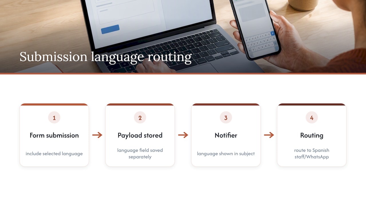
Once a bilingual form collects a submission, the language the visitor used needs to travel with it, not get lost at the point of entry. Capture the selected language as its own field in the payload, separate from any translated content, so your CRM or inbox can filter and route by it automatically.
Confirmation messages and autoresponders should match the language the form was submitted in, not default to English. If your intake flow sends a “we received your message” email, maintain both versions as templates tied to the stored language value rather than guessing from the message content itself.
Internal notifications matter just as much as the visitor-facing ones. Whoever receives the form submission on your team needs the language flag visible immediately, ideally in the subject line or at the top of the notification, so a Spanish-language inquiry does not sit unanswered because nobody on shift reads Spanish fluently. Routing a Spanish submission into a WhatsApp thread or a bilingual staff member’s queue, rather than a general inbox, cuts the lag between submission and first response substantially.
If multiple team members handle incoming messages, a shared inbox tool with tagging and routing rules, like the setup described in SendSync’s guide to handling multiple clients, keeps bilingual submissions from getting buried in a single shared queue.
Localization goes beyond swapping words
Translating field labels is the easy part. The harder part is adjusting formats, tone, and expectations so the form feels native rather than translated.
Date formats differ by convention: many Spanish-language users expect day before month, so label the format explicitly (“DD/MM/AAAA”) rather than assuming your visitor reads it the same way an English-speaking visitor would. Phone number formatting, address fields, and even the formality of your pronoun choice in Spanish (“usted” versus “tú”) all signal whether a form was built with care or bolted on as an afterthought.
Tone matters as much as grammar. A direct, informal request that reads as friendly in English can land as abrupt in Spanish if translated word for word. Field names that work in English intake forms, like “insurance provider,” sometimes need a slightly different framing in Spanish to match how people actually describe their coverage when speaking with a receptionist rather than filling out a government form.
Cultural expectations around response time also shape how a form should set expectations. If a visitor fills out an intake form in Spanish, stating clearly when and how they’ll hear back, and in which language, reduces the follow-up calls asking “did this actually go through?”
Publisher notes on this guide
This guide draws on W3C and WAI accessibility documentation, federal language-access guidance, and the practical patterns we see across bilingual front-desk implementations for dental, legal, and healthcare practices. The recurring theme across those practices is the same: form accessibility and translation quality are treated as separate problems when they should be solved together, from the first field label to the last confirmation email. A closer look at how bilingual support compares to piecing together separate agencies shows where most of that disconnect comes from.
A priority order worth following
The most common mistake I see is treating translation as the finish line and accessibility as optional polish, when both determine whether a bilingual visitor actually completes the form. If you fix one thing first, make every label visible and add a language selector near the top. Everything else, validation, consent wording, routing, builds on that foundation.
— Francisco
How Diazluna can help you get this right
Building and maintaining a fully bilingual, accessible contact form is one piece of a larger communication gap most practices face with Hispanic clients. Our platform pairs a fully bilingual website with a 24/7 AI receptionist fluent in Spanish and English and WhatsApp integration, so form submissions, calls, and messages all route through one bilingual front desk instead of three disconnected tools.
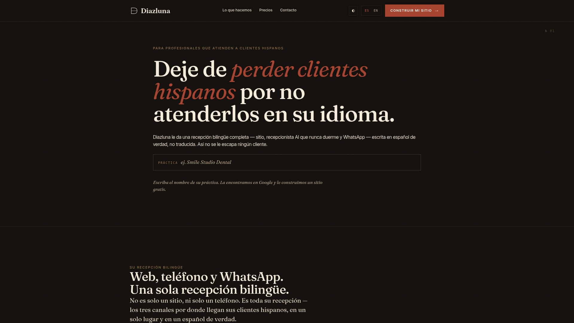
Plans start at Solo Sitio for the website alone, with Sitio + María adding the AI receptionist for practices that want calls and messages handled around the clock. Visit Diazluna to see the bilingual front desk in action and request a walkthrough of the templates built into it.
FAQ
What fields should a basic bilingual contact form include?
A basic bilingual contact form needs name, preferred language, phone, email, and a message field, each with a visible label in both English and Spanish. Adding a preferred-contact-method field helps route the response through the channel the visitor actually checks.
Do I need a separate Spanish-language page or just a toggle?
A single page with a language toggle works for most contact forms, as long as the toggle changes every visible label, instruction, and error message, not just the headline text. The W3C’s form instruction guidance recommends placing those instructions before the form so the change is announced consistently regardless of which language is active.
Is machine translation good enough for legal or medical consent text?
Machine translation can work for simple labels, but consent and legal wording benefit from human review because tone and legal nuance often shift in direct translation. A hybrid approach, machine draft plus native review, is the safer standard for anything tied to consent or liability.
How do I make sure labels work with screen readers in both languages?
Use a real <label> element paired to its input with matching for and id attributes, since placeholder text is not read as a persistent label by assistive technology, per W3C technique H44. Testing with NVDA or VoiceOver in both languages before launch confirms the labels announce correctly.
How much of my audience actually needs a Spanish-language option?
That depends heavily on your specific client base and location, but national data on language spoken at home among the Hispanic or Latino population gives a useful starting point for estimating local need. Checking your own inquiry logs for language preference, once you start collecting it, gives a far more accurate picture than any national average.
Sources
- H44: Using label elements to associate text labels with form controls | WAI | W3C
- Language Access in Digital Portals (LEP guidance)
- Language Spoken at Home by Ability to Speak English for the Population 5 Years and Over (Hispanic or Latino) — American Community Survey