November 11, 2026
Language Switch UX: Placement, Labels and Persistence

A good language switch is easy to find, labeled in each language’s own name, and it keeps the visitor on the same page after the switch. Put it in a top corner of the header on desktop. Keep it above the fold or inside the menu on mobile. Write “Español” and “English”, not flags. Never redirect visitors by guessing from their location. This guide covers each decision, with the research behind it and the details that usually go wrong on bilingual English and Spanish sites in the U.S.
TL;DR
- Place the switcher in the top-right corner of the header on desktop (top-left is the second choice). On mobile, keep it above the fold or in the navigation menu.
- Label each option in its own language (Español, English) and skip flags, which stand for countries and not languages.
- Link to the equivalent page in the other language, not the homepage, and remember the visitor’s choice.
- Do not force a language by IP address or browser settings. Suggest, and let the visitor decide.
- Mark up the switcher for accessibility:
langon each option,aria-currenton the active one, and enough color contrast.
Table of Contents
- What a language switcher does, and what it does not
- Where to put the language switcher
- How to label the options
- Keep the visitor on the same page
- Automatic detection: suggest, never force
- Accessibility details most switchers miss
- A quick checklist for a two-language practice site
- Perspective
- Where the switch fits in the whole bilingual experience
- Get the switch, the pages and the front desk in one package
- FAQ
- Sources
What a language switcher does, and what it does not
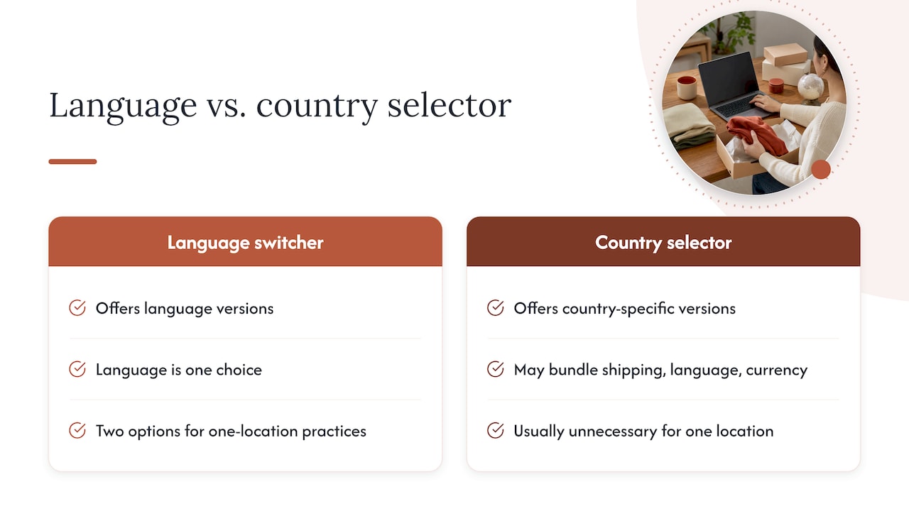
A language switcher lets a visitor change the language of the content. A country selector is a different control. Nielsen Norman Group separates the two: a language switcher offers language versions, while a country switcher offers country-specific versions that may bundle shipping destination, language and currency.
For a dental office, law firm or clinic with one location, you almost never need a country selector. You need a simple two-option language control. Keeping the two ideas apart avoids a common mistake: asking a patient in Houston to choose a country when all they want is to read your page in Spanish.
The same principle applies to settings. Recent UX research on language selectors argues that language, region and currency should be decoupled, because people have unusual combinations, such as wanting a local-language interface with international shipping. For a service practice, that translates to: language is one choice, and nothing else rides along with it.
Where to put the language switcher
Desktop
Visitors look for the switcher in the corners of the header. NN/G’s recommendation is to place it in the top corners on desktop, most often top-right and then top-left. The U.S. Web Design System, the federal government’s design standard, goes further for two-language sites: it says to put the selector button at the top of the screen, above the site navigation, so the user can toggle between the two languages.
That last detail matters for a bilingual practice. If your navigation reads “Services, About, Contact” and a Spanish-speaking visitor cannot parse it, a control buried in the navigation is already too late. A control sitting above it gets seen first.
Mobile
On a phone, space is tight and the header usually collapses into a menu. The guidance is to keep the switcher above the fold, or inside the navigation menu. Our preference for two-language sites is to keep a visible toggle in the mobile header itself, because opening a menu requires reading the menu icon and then reading its contents, and the people who most need the switch are the ones least able to do that comfortably.
If your layout forces the switcher into the menu, put it near the top of the list, not at the bottom after nine links.
The footer as a backup
A footer link is a good second location, particularly for returning visitors who want to reopen their choice. It is a supplement, never the only place. Visitors who cannot read the page will not scroll to the bottom looking for a language option.
How to label the options
Use each language’s own name
Write “Español”, not “Spanish”, and “English”, not “Inglés”. The reason is practical: the visitor may not be able to read the current page. NN/G advises labeling languages in their own language so people can recognize theirs even when the interface is unreadable to them.
This is a trap for sites that are built in English first. A button reading “Spanish” on an English page is only useful to people who already read English. The person you are trying to reach sees nothing familiar.
Skip the flags
A flag represents a country, and languages do not map to countries one to one. The U.S. Web Design System says flags should not stand for languages because they do not map uniquely to a language, and that they can confuse or exclude people. Spanish alone is the main language in a long list of countries. A Mexican flag will feel wrong to a Colombian patient, and a Spanish flag may feel wrong to nearly all of your audience.
NN/G adds that a flag should not be the only indicator in any case: pair it with the language name or another indicator. For a two-language practice site, the simplest answer is text only.
Globe icons: helpful, not sufficient
A globe or translate icon can help recognition, and many users look for one. Treat it as a companion to the text, as a small icon next to “Español”. An icon alone asks the visitor to guess.
Toggle or dropdown?
With only two languages, a single visible toggle that shows the other language (on the English page, “Español”; on the Spanish page, “English”) beats a dropdown. It takes one click and has no menu to open. Dropdowns earn their place when you have three or more languages. The USWDS pattern for exactly two languages is a single button, and that is the right default for most practices.
Keep the visitor on the same page
The most frustrating switcher failure is the one that dumps you on the homepage. A visitor reading your Spanish page about dental implants clicks “English” and lands on a general welcome page. The path is lost, and many will leave.
The better behavior, described in this language switcher specification, is to link to the exact equivalent page in the target language, for example from /pricing/ to /es/pricing/, and not back to the home page. That means every English page needs a real Spanish counterpart, and the switcher needs to know the mapping.
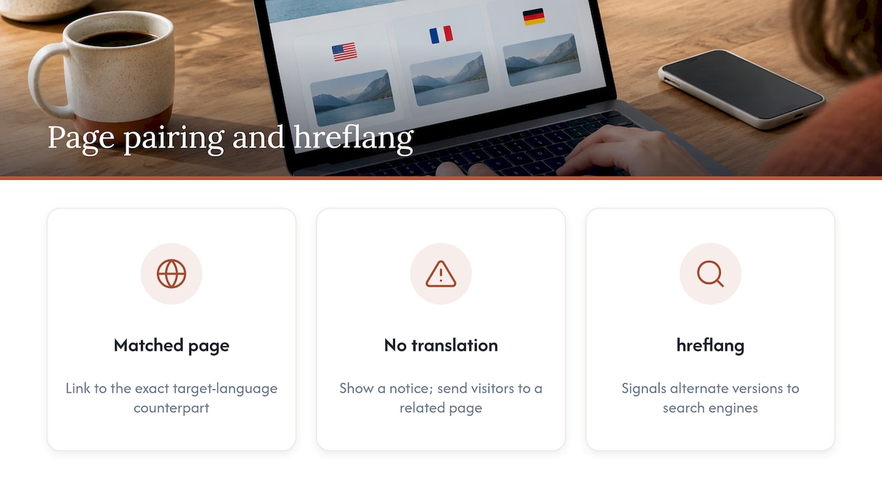
Where a page has no translation, say so briefly in the visitor’s language and send them to the closest related page, not to a dead end.
The same page pairing is what search engines need. Use hreflang annotations alongside the switcher so alternate language versions are signaled to search engines and the right page can be served to the right person. We cover the audit step by step in our 20 minute hreflang audit, and the navigation side in our guide to bilingual website navigation with lang attributes.
Remember the choice
Once someone picks Spanish, keep them in Spanish. Smashing Magazine’s piece on language selectors describes Patagonia saving the preference in a cookie and offering a footer link to reopen the selection. That pattern is worth copying: the choice persists, and the way back is always visible.
Automatic detection: suggest, never force
It is tempting to read the visitor’s location or browser and send them to the “right” language. The U.S. Web Design System advises you to avoid automatic redirects based on location or browser settings, because they can be confusing and disorienting.
Think of a bilingual family sharing one laptop, a patient using a work computer set to English, or a Spanish-speaking visitor on a phone configured in English because that was the default. A redirect guesses wrong for each of them, and the visitor has no idea why the page changed.
There is a search side to this too. Automatic redirects can cause indexing problems because crawlers visit from different IP addresses and language settings, which makes the effect on SEO unpredictable. If you want to go deeper on how multilingual pages are found, this overview of multilingual SEO content is a good next step.
A workable middle path, in line with NN/G’s guidance: default to the language that matches the browser settings, let people change it later, and if you cannot tell, ask instead of guessing. For a practice, that can be as simple as a small, dismissible banner in Spanish on a first visit that offers to continue in Spanish, with the page still readable underneath.
Accessibility details most switchers miss
A switcher is a control like any other, and the people who rely on it most include those using assistive technology. Four details:
- Contrast. Make sure there is enough color contrast between the button, its text and the background. The USWDS pattern calls this out directly.
- Real button behavior. If the control is coded as a link, add
role="button"and support both Enter and Space, as USWDS instructs. - A
langattribute on each option. Tag the “Español” link withlang="es"so a screen reader pronounces it in Spanish and not in an English voice. This is described in the language switcher specification. - Current language marked. Use
aria-current="true"on the active language, or style it as non-interactive, so screen reader users know where they are, per the same specification.
If your practice is a healthcare provider or a law firm, accessibility is also a legal topic in the U.S. Our guide to multilingual ADA steps covers that side.
A quick checklist for a two-language practice site
| Decision | Do this | Avoid this |
|---|---|---|
| Position (desktop) | Top-right of the header, above the main navigation | Footer only |
| Position (mobile) | Visible in the header or top of the menu | Last item in a long menu |
| Label | Español / English | Spanish / Inglés, or flags alone |
| Control type | One toggle showing the other language | Dropdown for two choices |
| Destination | Equivalent page in the other language | Homepage |
| Memory | Save the choice; keep a way to change it | Resetting on every visit |
| Detection | Suggest with a banner | Forced redirect by IP |
| Markup | lang, aria-current, contrast, hreflang | Image-only button |
Perspective
We build bilingual front desks for dentists, lawyers and clinics, so we see the same switcher mistakes again and again. The most common one is not a design flaw. It is an assumption that Spanish is a feature added on top of an English site.
A patient who reads Spanish first decides in a few seconds whether your practice is for them. If the first thing they see is an English page and a small gray “Spanish” link, they have already got their answer. That is why we treat the switch as the front door of the Spanish experience, not a utility.
The second assumption is that the switch is the whole job. It is not. A switcher that lands on a thin or machine-translated page is worse than no switcher, because it promises something the page does not deliver. Our approach is human-reviewed Spanish content written to read naturally, not translated word for word, with every page paired to its English equivalent so the switch keeps visitors where they were.
The third is that the choice should stay with the visitor. We would rather suggest than redirect, and rather remember than ask again. The goal is that a Spanish-speaking client can book, call or message you without ever feeling like a guest on the wrong version of your site.
Francisco
Where the switch fits in the whole bilingual experience
The switcher is only the entry point. What follows it decides whether the visitor becomes a client: the page they land on, the phone number they call, the way they book. A visitor who switches to Spanish and then reaches an English-only voicemail has hit the same language wall one step later.
For law firms, that continuity is the difference between an inquiry and a lost case, which we explain in our pieces on a bilingual law firm website and a Spanish website that converts. For clinics and dental offices, see our guide to bilingual medical websites. For the broader business case, read what a bilingual business website means for growth.
Get the switch, the pages and the front desk in one package
Diazluna combines a bilingual website in Spanish and English, a 24/7 AI receptionist and WhatsApp integration, so the language switch leads somewhere useful at every step. Our site setup is free, and the plans are:
- Solo Sitio: $99 per month or $990 per year, for the bilingual website alone.
- Sitio + María: $199 per month or $1990 per year, adding the AI receptionist that handles calls, messages and scheduling.
- Sitio + María Pro: $349 per month or $3490 per year, the full-service managed package with site updates and expanded call capacity.
There is a one-off activation fee of $399.
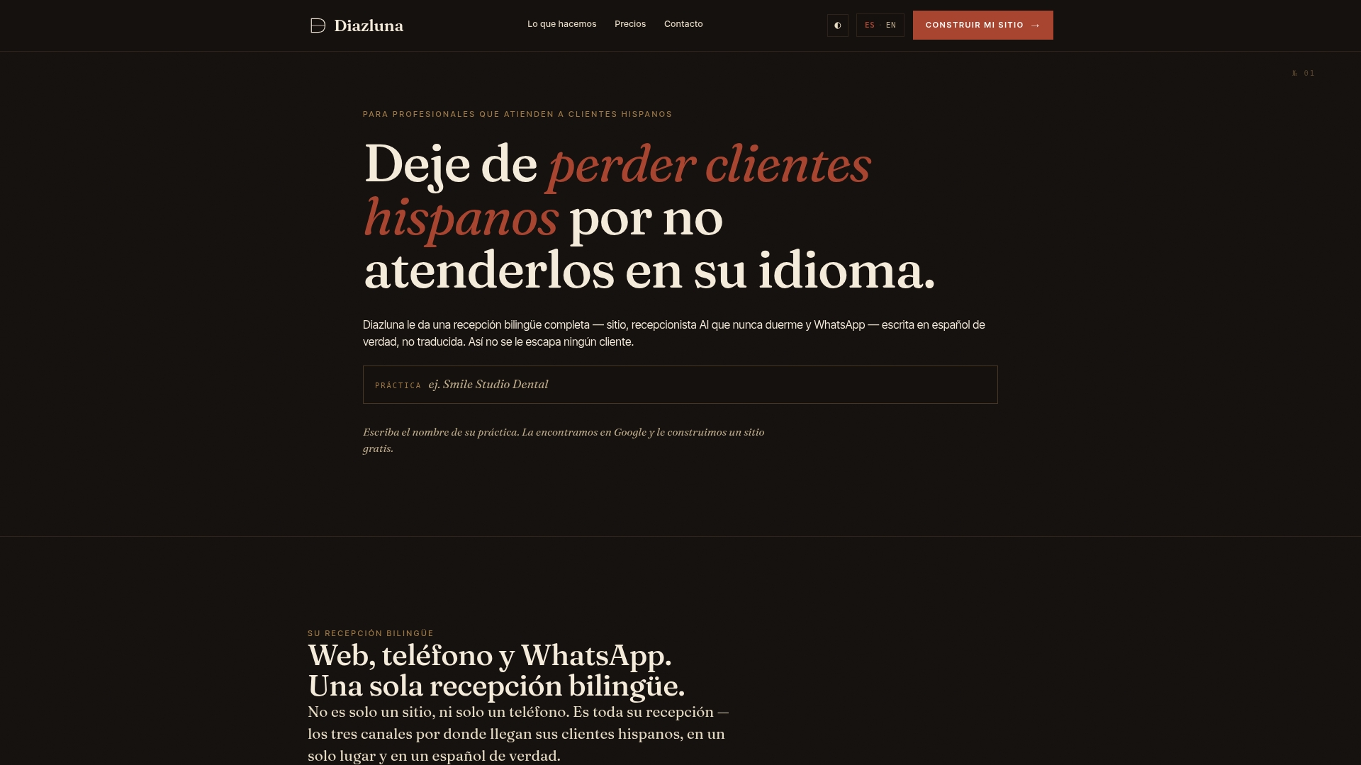
See the plans and start on the Diazluna site.
FAQ
Should a language switcher use flags?
No. Flags represent countries, and a language does not belong to one country. The U.S. Web Design System advises against using them for languages for that reason. Use the language’s own name, such as Español, optionally with a small globe icon.
Where should the language switcher go on a mobile site?
Keep it above the fold or inside the navigation menu, as NN/G recommends. For a practice with only two languages, we prefer a visible toggle in the mobile header. If it must go in the menu, make it one of the first items.
Should my site switch languages automatically?
It is safer not to. Redirecting by location or browser settings can disorient visitors and cause indexing trouble. Offer a clear suggestion, such as a short banner, and keep the visitor in control, with the choice remembered for next time.
What should happen when someone clicks the language switch?
They should land on the same page in the other language, not the homepage. That requires a matching page for each one, linked with hreflang annotations so search engines understand the pairing.
Sources
- 6 Tips for Improving Language Switchers on Ecommerce Sites, Nielsen Norman Group
- Two languages, U.S. Web Design System
- Designing A Perfect Language Selector UX, Smashing Magazine
- Language Selector, DesignPath
- Language switcher specification
- Automatic User Language Detection, TranslatePress